

Heat (2014)
Contemporary artist Mel Chin invited me to contribute a video to SEA to SEE, his large-scale installation, commissioned for the Mint Museum’s exhibition “Connecting the World: The Panama Canal at 100” in 2014.
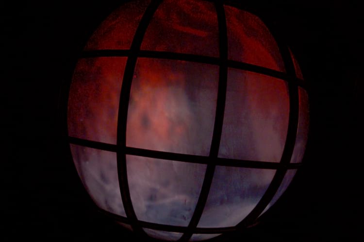
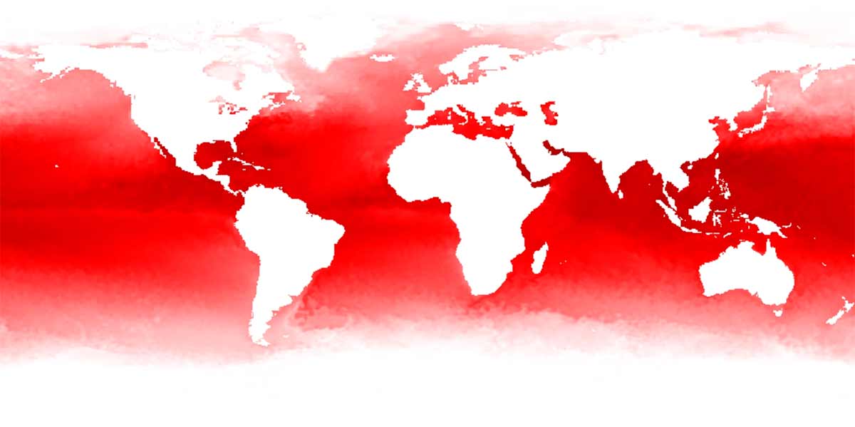
Heat is my contribution to SEA to SEE. The dynamic data visualization consists of millions of data points measuring sea surface temperature from 1981 to 2014. The visualization uses data gathered from Advanced Very High Resolution Radiometer, a technology developed by the National Oceanic and Atmospheric Association (NOAA). Red represents relative heat on a geographic map of the world. Time is sequential. The ocean heats up over time, hot water pressing outward towards the cold water at the poles. Two sickening bands form one north, one south, and they oscillates, becoming darker and more distinct. The video loops forward then backward then forward, witness to the all-too-visible effects of climage change. The video recontextualizes ubiquitous weather data, creating a map of the longitudinal effect of climate change on the world’s oceans at high resolution on a global scale. The visualization renders familiar data unfamiliar, creating an aura as alluring as it is disturbing, and pointing to the power of visualization as a medium.
Heat was a contribution to Chin’s installation, which the artist describes as follows:
As an option to making an additional artwork regarding the manmade canal, the artist seeks to create a work that focuses on the oceans it connects. Instead of expressing the sea in symbolic form, the effort is to create two unique cinematic portraits, one of the Atlantic and one of the Pacific Oceans, utilizing animated visualization of oceanographic data. Because the research is vast and diversified, the artist is creating a format for creativity and collaboration, looking to engage scientists/historians to work with him and to have his/her inquiry, or area of expertise, developed into a unique film. The challenge is to translate the research visually and to render it as a moving current on the screen where information becomes a cinematic ribbon of oceanographic data. Ultimately, many films will be made, and once collected they will be layered/edited together to create composite portraits of the Atlantic and Pacific Oceans.
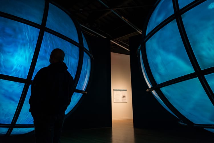
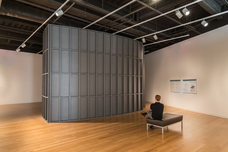
The films will be witnessed by museum audiences standing before two massive hemispherical glass projection screens facing each other in the installation. Designed with the skeletal frames of the Panamanian Miraflores lock doors in mind, they will appear as 12ft.-in-diameter bulges holding back the Atlantic and Pacific waters that lie on opposite sides of the historic canal. The glass panes will sandwich translucent plastic debris and sprays of crude oil (a reference to the islands of plastic waste and oil spills) to create a surface for back-projected films that loop in 10-minute sequences.
The information presented will be based on research on the transformation of the oceans during the 100 years since the building of the canal, quite possibly conveying the impact of human constructions on the ecology of the oceans. The data visualization will result in digitally-created films, layered upon each other as an “aquafied articulation” of historical, cartological, and factual understanding of the oceans…
The artist seeks a creative partnership with scientists (in both science and art) and research universities to take on and reformat individual scientific investigations into data, to make independent films that can be part of this streaming informational compilation, SEA to SEE. The artist will work closely with any collaborators.